Scenes
THE SCENE EDITOR
The Scene Editor is a key element of the SignageStudio. It is used to enrich your SignageStudio presentation by allowing you to use multiple components (resources and dynamic data feeds) and combine them into a single scene, so they can be embedded into a single Screen Division.
You can access the Scene Editor from the main Navigation menu located on the left side of the SignageStudio.
|
|
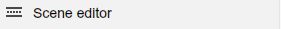
Select the Scene Editor tab.
|
|
- Tip: You can always hover with your mouse over an icon for a quick a tooltip
|
|

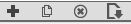
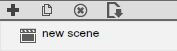
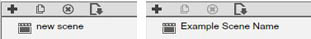
Click on the plus icon to Add / Create a new Scene. The default name is "New Scene" and will appear in the Scene's panel.
|
|
Before the new scene was created, the rest of the icons were disabled because their action depended on the existence of a scene.
|
|
|
|

If you left click on the above icon, you will be able to duplicate or "make a copy of" an existing scene.
|
|
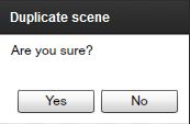
Choose YES, and a duplicate Scene will be created in the panel; a Scene with the same components and settings as the original Scene. Click NO, to CANCEL the operation.
|
|

To delete a scene click on the "x" button.
|
|
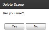
If you choose YES, the selected Scene will be DELETED. Click NO, to CANCEL the operation.
Tip: Remember like any other action, the DELETE action cannot be undone. If you think you've made a mistake and you did not SAVE the changes yet, EXIT the application. When you restart the application will be restored to the last save point.
The "Import Scene" allows you to browse pre-made Scenes.
|
|

Select a Scene from a collection of Scenes available through the MediaSignage library.
|
|

|
|
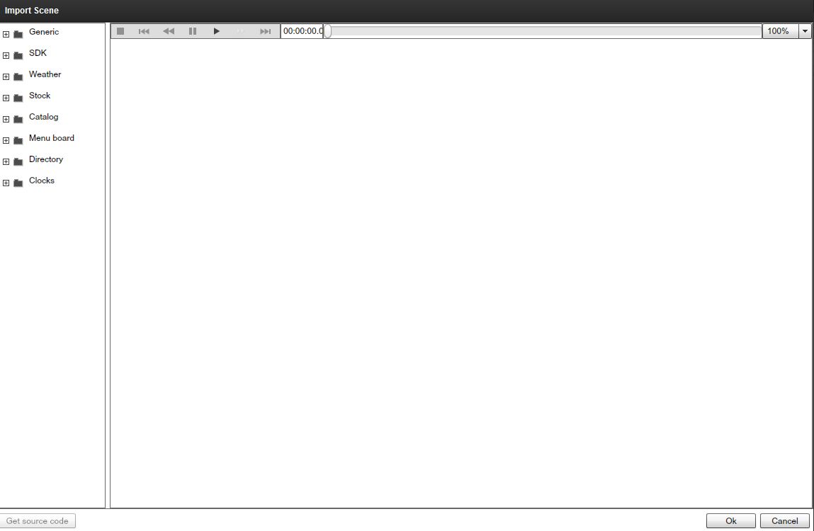
On the left side you'll see different folders containing several types ofScenes you can import into your project.
The Scenes are pre-built, you can use them as they are or you can modify their content. In the middle of the window you will see the Preview area. Select a file from the folder list to preview it's content.
|
|
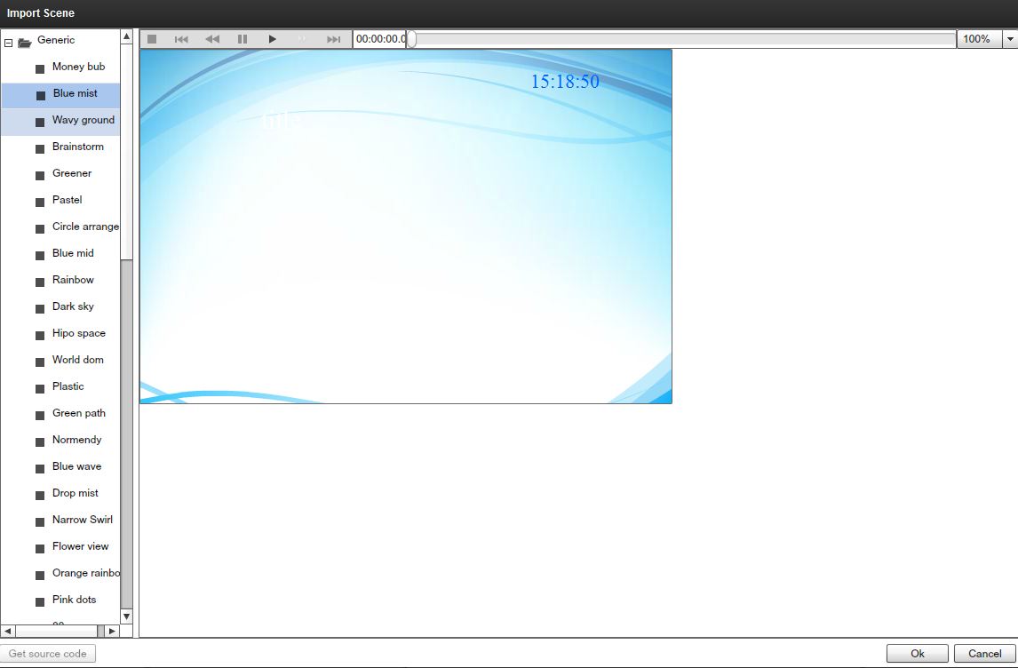
At the top of the Preview area you'll notice a playback controlMenu.
|
|

- The STOP button will stop a playback scene.
|
|

- The FAST REWIND button will set the playback to jump to the beginning of the file.
|
|

The REWIND button will rewind the playback one frame.
|
|

- The PAUSE button will PAUSE the playback of the selected Scene.
|
|

- The PLAY button will begin playing in the Scene.
|
|

- The FORWARD button will move the playback forward one frame.
|
|

- If you END icon the playback will jump to the last frame.
|
|

- Playback offset time
|
|
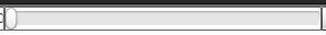
- This is the playback slider. Use it to scroll back and forth within the scene's timeline.
|
|

Tip: You'll find these playback controls on every Preview window across multiple areas of the SignageStudio. You can use them in the same manner to control the preview playback.
IMPORTED SCENES
As we stated above, the Imported Scene will allow you to take advantage of prebuilt Scenes which are sorted in different folders. These folders include:
- GENERIC (SWF prebuilt files, usually used for Scene backgrounds) - SDK (Software Development Kit, SWF examples)- WEATHER (Prebuilt Weather Scenes)- STOCK (Prebuilt Stock Scenes)- CATALOG (Catalog component Scenes)- MENU BOARD (Premade Menu Scenes)- DIRECTORY (SWF Listings, Directories) - CLOCKS (Prebuilt SWF Clocks)
RENAMING A SCENE
You can rename a Scene at any time by clicking on its name in the Scene's panel. The default name will become editable and you can enter a new string.
|
|
SCENE PROPERTIES
The properties panel contains different settings you can make to a Scene or to a Component including its width and height. Later in this Chapter, we'll discuss the Scene Components. However, the settings you apply to a scene will also affect all the components added to the scene. Therefore, if you'd like to make custom settings for each component you add, you need to modify the properties in the properties panel of the specific component, instead of choosing to apply the settings to the entire scene.
Each time you select a Scene in the Scene panel, you'll be able to apply certain settings to the Scene. You can do this in the Properties panel, located by default on the right side of the application.
|
|
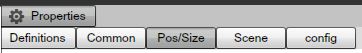
The Scene properties panel has four categories for its settings:
- LAYOUT- SCENE- CONFIG- COMMON
You can access these by selecting specific tabs.
|
|
LAYOUT PROPERTIES
When you access the layout properties of a Scene, you'll be able to choose the layout for a Scene. These settings can be broken into two categories:
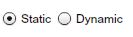
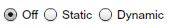
Static vs Dynamic.
This option refers to the behavior of a Scene when it starts playing in a timeline.
|
|
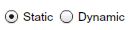
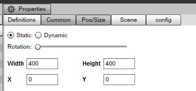
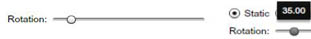
STATIC LAYOUT
When the "Static" layout is enabled,
|
|

It means no animation of any kind is applied to the layout of a Scene when played back. There can be motion inside the Scene (like a video file or a SWF for example), but the Scene itself will not animate.
The settings you can apply to the Static layout of a Scene are the Rotation property, the size and the position of a Scene.
|
|
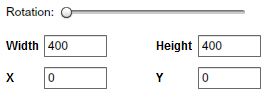
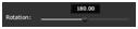
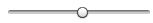
The rotation property has a slider that is used to change the Rotation of the entire scene. Drag the slider with your mouse and the Scene will rotate.
|
|

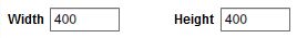
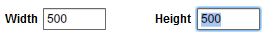
Under the rotation settings you can change settings for the Width and the Height of a Scene, as well as for the x and y position of a scene in respect to the Screen Division assigned to it.
If you want a Scene to be aligned perfectly to the x and y axes of the Screen Division assigned to it, you should always leave the x and y values at 0. You can modify any default value by entering a new value in the desired field.
Important: remember to use a Width and Height values that will match the size of the Screen Division the scene will be assigned to.
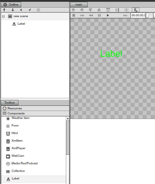
We will elaborate more on Components later on in this Chapter, but as a quick example, to see the rotation property working we will add a "Label" component to a Scene. Using your mouse, drag the Label component and drop it inside the Main preview window.
|
|
The rotation property has the default value of 0 degrees. If we drag the rotation slider to the right you'll notice a tooltip showing you the selected degrees.
|
|
After you release the mouse you'll notice the scene is now rotated with all components in it.
DYNAMIC LAYOUT
When the Dynamic Layout is enabled, you will be able to add animation to the Scene.
|
|

If you choose to enable the dynamic option, additional settings will be exposed in the properties panel. Let's go over these settings.
|
|
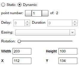
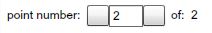
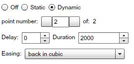
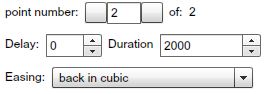
POINT NUMBERS
Below the Static and Dynamic options is the "point number" field.
|
|
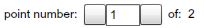
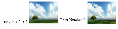
The Point Number is an indicator referring to the position of a scene in regards to the settings applied to its dynamics. Point number "1" indicates the initial position of the Scene, before the Dynamics (animation) kicks in. Point number "2" indicates the final position of a Scene, after the Dynamics (animation) has ended. Between point number 1 (the initial position), and point number 2 (the final position), certain parameters can be controlled. These parameters allow you to add motion to the appearance of a scene when played back. The main settings applied to a Dynamics of a scene are in respect to theRotation, and the Size. You can also add easing effects to the selected animation.
|
|
The Rotation works almost the same as described above as in the Static section. The difference is that in the Dynamic layout, Rotation actual motion, and not Static position. Rotation values can be changed both in point 1 and point 2. This is also the case of the Width and Height values as well as x and y coordinates.
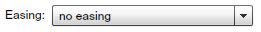
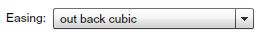
The Easing options are effects applied to the Dynamic layout of a Scene and they define the transition algorithm from point 1 to point 2. You can only use the effects if you navigate to point 2. You can switch between point numbers using the left and right arrows.
|
|

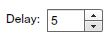
DELAY FIELD
The "Delay" field
|
|
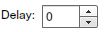
is used if a user needs to delay the timing until the Dynamic settings(Rotation and Size) kick in.
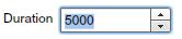
DURATION FIELD
The "Duration" field
|
|
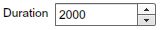
is used to define the duration in milliseconds of the motion.
Tip: if you want a scene to spin around (rotate) for a longer period of time before it comes to a stop; enter a higher value in the "Delay" field .
DYNAMIC LAYOUT EXAMPLE
Step 1: Select a Scene from the Scene panel.
|
|
Step 2: At point number 1, drag the Rotation handle to the right until the tooltip shows 180 degrees,
|
|
and set the values to 200 for the Width and 200 for the Height.
|
|
Step 3: Using the right arrow, switch to point number 2.
|
|
Step 4: Enter the value 5000 in the Duration field.
|
|
Step 5: Enter the value 5 in the Delay field.
|
|
Step 6: Choose the Easing option "out back cubic."
|
|
Step 7: Set the value 500 for the Width and 500 for the Height of the scene.
|
|
Step 8: Click on the PLAY button to see the result and notice the dynamics of the Scene; how it will rotate and change its size over time.
|
|

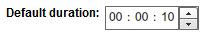
SCENE TAB
The scene tab allows you to modify the default duration of a Scene when it is inserted onto a Timeline. You can change the default duration of a scene by entering the new time values in the corresponding fields. The first field stands for hours, the next is for minutes and the last field is used to set the timing in seconds.
|
|
Tip: The duration of a scene can be managed directly in the Timeline. It is not mandatory to change the duration from the Scene tab.
CONFIGURATION TAB
When you click the configuration tab
|
|

you will be presented with the scene property panel, you'll be able to assign a folder for the selected scene; enter the name of the folder in the "Folder" field.
|
|
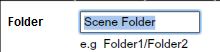
A new folder will be created containing the selected scene.
- Tip: You can read more on folders and subfolders in the chapter of File and Resource management.
Also in the configuration Tab, you are able to see what Access key has been assign to you by the administrator.
COMMON TAB
When you click the Common tab
|
|

in the scene property panel, you will gain access to additional scene specific properties.
APPEARANCE
When you select the "Appearance" Tab under the Common section, you will be able to set transparency (Alpha) of the selected scene and also set a blending mode.
|
|
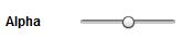
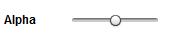
STATIC APPEARANCE
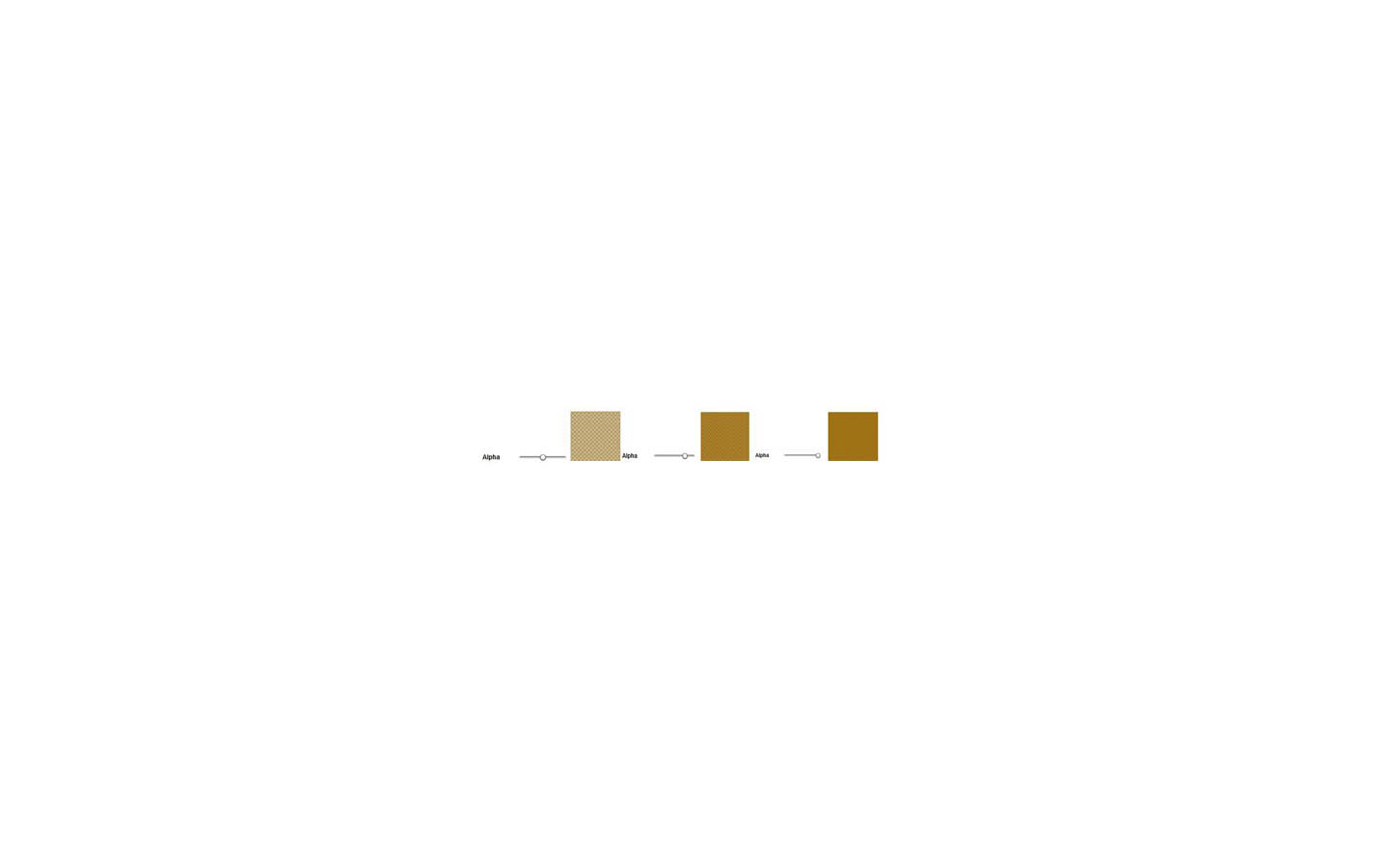
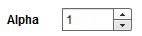
Under the Static appearance tab you can set the Alpha of a scene; control the Alpha value using the slider.
|
|
Example of different settings of Alpha applied to a Scene with a brown background.
|
|
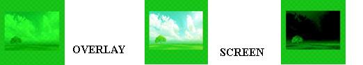
BLENDING MODES
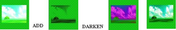
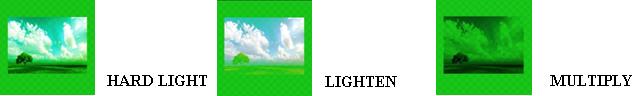
Blending modes control how a Scene blends with or interacts with other Scenes or Components beneath it. Blending modes in the SignageStudio work in a similar way as blending modes in other designer applications like Adobe Photoshop. The way layers interact with other layers in the stack is determined by the blending mode of the upper layer. By default the layer's mode is set to Normal, which causes the picture content on the upper layer to obscure the picture parts beneath, but SignageStudio has many other ways to control how these pixels interact. The different options, called blend modes, provide a variety of ways to control the mixing, blending, and general interaction of the layer content.
There are thirteen different blending modes to choose from in the SignageStudio. The default state for blending modes is "Normal" as we mentioned above and selecting it means no blending mode is applied to the selected Scene.
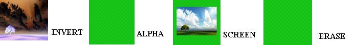
Let's see some examples of using blending modes. To see the effect of a blending mode we need to have at least two layers, positioned one on top of the other.
Tip: Blending modes can also be applied to any component as well as to a scene.
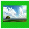
For our example the first layer is a colored background and the second one is an image. The upper layer is the image and beneath it is the background. In the image below we did not use any blending modes.
|
|
Next, let's select the Static appearance for the image and see how different blending modes affect the pixels of the image.
|
|
Difference
|
|
|
|
Subtract
|
|
DYNAMIC APPEARANCE
You can choose a Dynamic appearance and be able to set different blending modes for point number 1 and point number 2, which means as the Scene / Component / Resource starts to play on the timeline, it can gradually pass from one blending mode to another.
In the same time, you can also set different values for the alpha channel of the selected layer, at point number 1 and point number 2.
Let's use the same layers
|
|

and make the following settings for the next example.
Step 1: Select the imageStep 2: Set the appearance to dynamic
|
|

Step 3: At point number 1, drag the slider for the alpha channel to center.
|
|
BORDER
If you click on the "Border Tab"
|
|

you access the area where you can apply different settings to the border of a scene. The Border option is off by default,
|
|

and if you prefer your scene to have a border around its margins, you can choose between a Static border and a Dynamic border.
STATIC BORDERS
When you select the Static border option
|
|

you are able to apply three different settings to the border of your scene.
CHANGING THE COLOR OF BORDERS
The first setting you see when you select the static border option is the COLOR of the border.
|
|
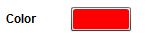
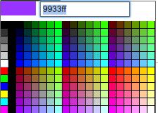
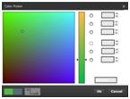
The default color is Red, but if you click your mouse on the color, a color picker will appear and it will allow you to choose a different color.
|
|
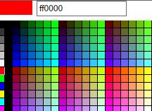
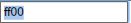
If you move the mouse pointer over the colors you can look at a small color preview in the left corner of the color picker. To choose a color for the border you can either click on the desired color to select it or you can enter a hexadecimal value in the field located next to the color preview area.
|
|
BORDER THICKNESS
The second option you'll see after selecting the Static border option, right below the color picker, is the Thickness settings of a border.
|
|
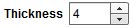
You can increase or decrease the thickness value either by entering a number on the specified field or choose one pixel at a time by using the small UP and DOWN arrows.
|
|

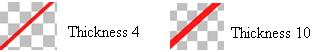
Example:
|
|
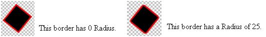
RADIUS BORDERS
The next option is to change the radius of a border, which means you can make its corners more or less rounded. The same principle, as in the case of a scene border, applies also to any Component; therefore we will use a random component to exemplify the Radius of its borders.
|
|
DYNAMIC BORDERS
If you select Dynamic border
|
|

after clicking on the border tab, you have the same options as discussed earlier in this chapter (referencing the Layout of a Scene).
You can add motion to the appearance of a border; make it rotate a few times before it becomes static, you can add an easing effect, set the delay and the duration.
In Addition to the above options, when you choose to apply settings to a dynamic border, you may also select different colors, different thicknesses, and different radius values for the two point numbers.
Tip: As an example, you can set the color to Red at point number 1; enter the value 4 for the thickness and 25 for radius. Navigate to point number 2 using the right arrow, and set the color to blue, enter the value 10 for thickness and 0 for radius. Click PLAY. You'll notice the border color will gradually switch from Red to Blue and the thickness and radius values will change.
BACKGROUND
If you click on the "Background Tab"
|
|
you'll be able to apply certain settings. These settings will affect the background of the selected Scene. By default, the Background is turned off. You can however select the Static Background option,
|
|

and then you have two choices, you can choose either a simple background or you can choose a Gradient background.
|
|
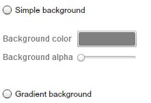
SIMPLE BACKGROUND
After you select the Simple background option you can apply two settings to the background.
1. Background color.
You can change the Background color by clicking the default color and then use the color picker to choose a different color.
|
|
2. Background alpha
The other setting you may apply when selecting a simple background is theBackground alpha option.
|
|
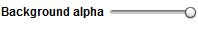
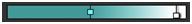
This option allows you to set a desired level of opacity for the background. Drag the slider to the left to set a different level of opacity.
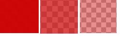
LEVELS OF BACKGROUND OPACITY
|
|
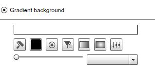
GRADIENT BACKGROUND
The gradient effect is used for backgrounds and has several settings that you may choose from to change or enhance the look and feel of the background.
|
|
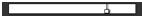
GRADIENT MAP
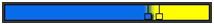
When you click ONCE with your mouse on the gradient map, a smallSquare / handle will appear.
|
|
If you double click the handle, you'll see a color picker and you can use it to set a color point.
|
|
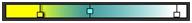
The color you choose will affect the area located between the selected handle and other handles from the gradient map. You can add as many handles as you want and try different color variations. As an example, let's click once on the right side of the gradient map and again around the middle. Double click the left side handle and choose a blue color.
|
|
Now, let's add a third handle and choose the yellow color.
|
|
Each color handle you create on a gradient map may be used to control the area the color covers, and also the opacity of the color in the gradient map. To control these options you'll use your mouse to drag the handle to the left or right, UP and DOWN over the gradient map.
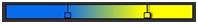
Let's use for the next example to create a gradient map with two handles. One handle controls the yellow color on the gradient map and the other the blue color.
|
|
|
|

COLORS IN THE GRADIENT MAP
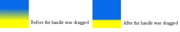
To control how much a color is spread on a gradient map, drag the handle controlling the color to the left or right. You'll notice the color will bleed with the other color. Drag the blue color handle to the right.
|
|
Compare the previews of the Background before and after
|
|
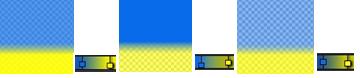
OPACITY OF A COLOR IN THE GRADIENT MAP
To control the opacity of a color in the gradient map, use your mouse to drag the handle that controls the color either UP or DOWN. If you drag the color handle UP, the opacity level will fall, making the color more transparent. If you drag the handle DOWN, the opacity level will rise until the color has no transparency.
|
|
Tip: We recommend you experiment working with color handles and combine different color gradients.
OTHER GRADIENT OPTIONS
Below the gradient map you'll find additional gradient tools.
|
|

COLOR GRADIENT PRESETS
|
|

The first icon is used to load a gradient map from a set of presets. Each time you click on this icon a new gradient map will load.
|
|
COLOR PICKER
|
|

The color picker is another option you can use to choose a gradient color. The first option we mentioned above is opening the color picker by double-clicking on a color handle with your mouse. In this case you must select a handle by clicking ONCE with your mouse and selecting the color picker icon to OPEN it. The color you choose will apply to the area controlled by the selected handle.
REMOVING A COLOR FROM THE GRADIENT MAP
|
|

This option is used to delete a color from the gradient map. You remove a color from the gradient map by deleting the handle that controls it. To remove a handle / color, first select the handle with your mouse and click on the DELETE icon.
|
|

CLEARING ALL GRADIENT COLORS FROM THE GRADIENT MAP
|
|

Selecting the CLEAR icon will reset all gradient colors and remove all map handles.
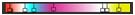
RADIAL GRADIENTS
|
|

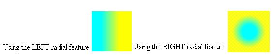
The Radial icons are used to create different radial types of gradient. The default gradient type has horizontal alignment. The radial options allow you to change to position of gradient colors and align the colors either from left to right, reverse or around the center of the Background.
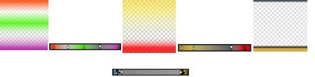
Examples of using the radial options for creating different types of gradient alignment :
|
|
SPREAD OPTION
Next to the Radial gradient options is the Spread icon.
|
|

If you click on the Spread icon, all the colors form a gradient map will spread equally along the gradient map so every color will cover an equal amount of space.
Example of using the Spread option :
Before using the Spread option:
|
|
After using the spread option:
|
|
Notice the distance between handles is equal after the Spread option was used.
ROTATING THE GRADIENT COLORS
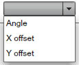
Another option related to the gradient map and the gradient colors is the ability to rotate the gradient by affecting its angle or its x and y offsets values.
In order use the gradient rotation function, first you need to select what properties you want the rotation to affect. You do this by selecting the Angle, the x offset or the y offset from small dropdown menu.
|
|
Next, rotate the gradient using the Rotation Slider.
|
|
Drag the slider to the right, add colors on the gradient, and look at the preview area. These are examples of using the gradient rotation option. We recommend you try out different rotation options and use different color to obtain a nice background gradient.
|
|

GLOW EFFECT
Next in the Common section of the Properties panel is the Glow effect.The Glow effect is used to add a glowing stroke around the margins of a selected scene or component. It has several properties you can change to control how it will modify the selected scene or component.
Before you start customizing the glow effect, choose static or a dynamic appearance.
|
|
STATIC GLOW
First let's use the Static option. After selecting the Static option you can apply different settings to the Glow effect. These settings are the blur, the strength, the alpha and the color of the glow.
|
|
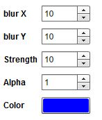
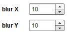
BLUR
You can increase or decrees the blurriness of the glow effect on the x and y axes either by entering a value in the corresponding fields or by using the small UP and DOWN arrows.
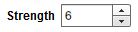
STRENGTH
Increase or decrease the strength of the blur effect applied either by entering a value in the corresponding field or by using the small UP and DOWN arrows.
|
|
ALPHA
The Alpha option is used to increase or decrease the opacity / transparency of the Glow effect. This can be achieved either by entering a value in the corresponding field or by using the small UP and DOWN arrows.
|
|
GLOW COLOR
Choosing a color for the Glow effect can be done in the same manner as with any other color property in the SignageStudio. Select the default color and choose a color from the color picker or enter a hexadecimal value in the corresponding field.
|
|

Example of a glow effect applied to a Label component. The initial text was white and after applying the Glow effect a glowing stroke appeared around the text.
|
|

DYNAMIC GLOW
Another option you have when working with the Glow effect is the Dynamic appearance of the Glow. If you select Dynamic,
|
|

|
|
Besides these options you can also control the properties of the glow effect and make them animate.
You can choose to use the color red as the initial color of theGlow effect and yellow for the second color. The glow will gradually change from Red to yellow as the selected component begins to play. You'll do this by setting the color red at point number 1 and the color to yellow at point number 2. Additionally you can set an easing effect. Click on the PLAY button from the preview area to see the result.
BLUR EFFECT
Use the Blur effect to control the blurriness of a Scene or a component. You can choose to set the blur level on the x and y axes. Set the blur level by entering a value in the corresponding fields or by using the small UP and DOWN arrows.
|
|
The appearance of the blur effect can also be either Static or Dynamic. When choosing the static option, you apply a static blur to the selected scene or component. If you choose the dynamic option you can apply the same settings as described above, related to other properties, but in this case you control the blurriness of a component over time (animated).
Let's use for example an image is a Background and you apply a Dynamic Blur effect to it. For point number 1 we set a blurriness level of 15 pixels on the x and y axes, and at point number 2 we set the blur level at 0 pixels.
|
|
In this case, the blurriness level will decrease gradually over time, from point 1 to point 2. We recommend you experiment with the blur effects and combine the available settings with the easing effects.
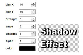
SHADOW EFFECT
Below the Blur effects, next to the Common section of the properties panel is the Shadow effect. This effect is used to apply a shadow to a scene or a component. As in other cases of using effects, you can choose to apply a static or a dynamic shadow effect.
STATIC SHADOW
If you choose the static shadow effect, you can change different settings. We discussed earlier in this chapter how to modify most of these settings like the blur, strength, alpha, and the color. Besides these settings, when using the shadow effect, you can also add new values to the angle of the shadow and the distance with regards to the selected scene or component.
|
|

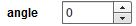
ANGLE AND DISTANCE
The Angle of a shadow can be modified by entering a new value in the corresponding field, or one pixel at a time using the UP and DOWN arrows.
|
|
The distance of a shadow represents how close or far the shadow is to itself in relation to scene or the component it has been applied to.
|
|
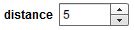
If you enter a higher value in the corresponding filed, the shadow will spread further away from the object. In the following example, we used the settings from the left image to apply a shadow effect to a label component.
|
|
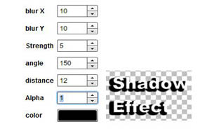
Now, let's change the angle and increase the distance of the shadow. See the difference between the two examples.
|
|
DYNAMIC SHADOW EFFECT
As in the case of other effects and properties discussed earlier in this chapter, the dynamic option is also available for the shadow effect. If you select dynamic
|
|

after you clicked on the shadow tab, you have several settings you can apply to create a dynamic shadow instead of a static one.
|
|
The difference is that the settings are controlling the dynamics of certain properties of the shadow effect. You can set different values for all the properties of the shadow effect discussed above in the static shadow section at point number 1 and point number 2; the values will animate.
|
|

MAIN VIEWING AREA
Located by default in the center of the application's interface, theMain viewing area is where you work with different components you'll add to the scene.
|
|
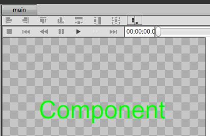
Earlier in this Chapter, we discussed controllers located at the top of the preview window (in the case of an imported Scene). The same buttons you'll see at the top of the main viewing area is also available for scenes. The size of the main viewing area is the same size of the Scene. If you have a larger Scene that exceeds the visibility in the main area, a scrollbar will appear at the bottom of the area and you can drag the slider to the left or right to scroll through the scene's content.
|
|

TOOL BOX
The Toolbox panel is located by default on the left side of the main viewing area of the Scene.
|
|

When you click on the Toolbox tab, you'll have direct access toResources and Components. To access the Components panel, simply click on the Components tab in the Toolbox panel, and you will gain access the resource's panel; click on the resources tab in the Toolbox panel.
To build a Scene you can use any Resource as well as components. To use a resource or a component in your scene, simply drag it from the toolbox main viewing area. First select the resource or component and with your mouse, drag and drop it to the main viewing area.
OUTLINE PANEL
The Outline panel is located by next to the toolbox panel, on the left side of the main viewing area. You'll use the outline panel to set the layering order of the items you use in a Scene as well as to delete items (resources or components).
In the following example we added five resources to a Scene.
To change the layering order, meaning to arrange certain resources above or beneath other resources, we need to use the UP and DOWN arrows of the outline panel.
|
|

Select the name of the resource or component and click on the UP or DOWN arrow to position it above or below other items.
|
|
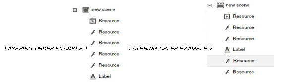
Remember the layering order of items added in a scene will affect certain aspects like transparency. The first item in the outline panel is the resource placed beneath everything else. It could be used as a background. All other resources lay on top of it.
DELETING AN ITEM
There are several ways to delete items.
1. Select the Item and click the delete icon in the outline panel
|
|

2. Select the Item and press delete on your keyboard
3. Right click on an item in the main viewing area and choose Delete
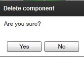
In all cases you'll be presented with a dialog box asking to confirm your action.
|
|
Copyrights MediaSignage© Inc